BRANDING PROCESS:
Below is a little insight into the design process when creating a brand for a client.
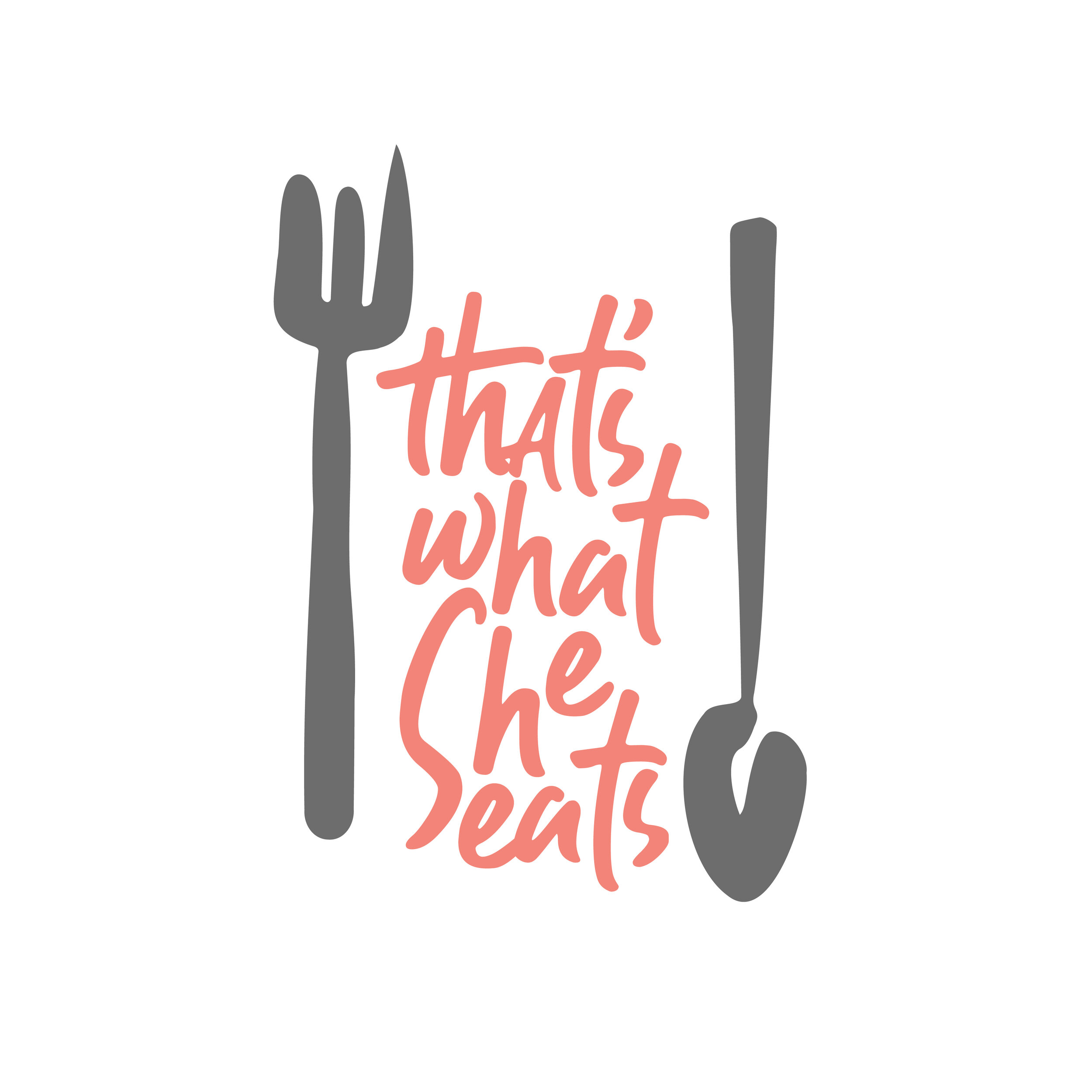
My client, a personal chef and instagram creator had a brand established by name but didn’t have a logo mark or cohesive branding for her site/blog. She hired me to make her brand feel more professional and legitimate. Check her out at instagram.com/thatswhatsheeats
STEP 1: Sketches
I like to ideate via sketching in illustrator because it helps the ideas that get presented to the client feel more buttoned up and helps non-visual people see the direction in a more clear way. I started out playing with colors and typefaces in the first set of “sketches” and then cleaned everything up for the second set of sketches before picking front runners to present to the client.
Brand Directions: Round 1
After presenting a handful of logo sketches to the client, below were the favorites she went with. From there, I refined them and started to play with colors based on her preferences — we tried playing with colors you naturally see in foods like citrus and herbs and wanted to pick something that felt fun.
FINAL LOGO TWEAKS
After choosing a final logo direction, we had some small tweaks to find the best shape for the utensils. Below was a sheet I presented to the client to help her choose her favorite fork and spoon/knife set.
FINAL LOGO
After making sure the client had no final tweaks, I presented a final single color and multi-color logo to her as seen below.
BRAND GUIDELINES
While not necessary in every context for every project, I think that providing a brief set of brand guidelines to a client helps keep up the integrity of the brand even once the final product is out of my hands. Please see the following PDF for an example of what a brand guide might look like.
Shoot me an email if you’d like to work together or if you have any design/branding needs!
